Bringing design consistency to print and digital assets
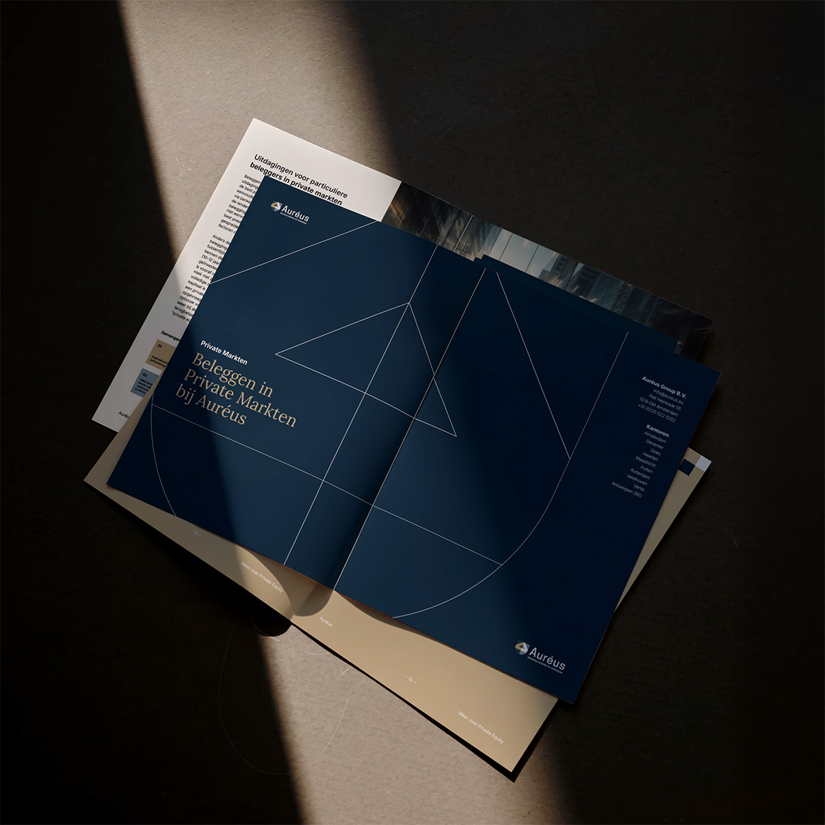
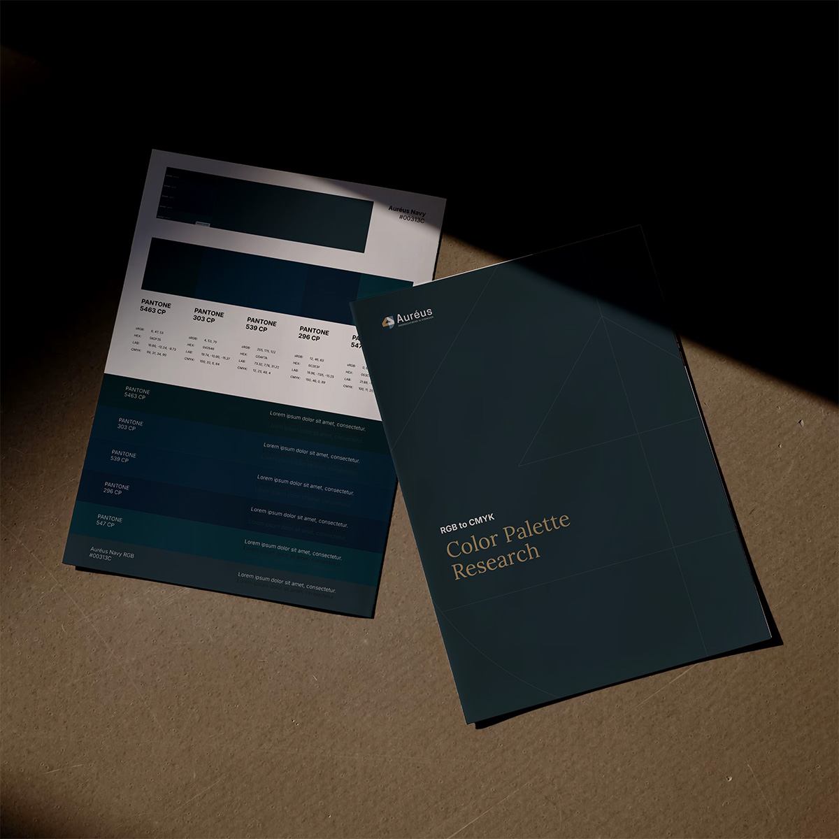
Auréus is one of the Netherlands’ largest independent wealth managers. We supported their brand evolution by formalising a CMYK print system and designing whitepapers that reflect their professional, high-trust positioning.
Client
Aureus
Services
Assets
Research
Workshop
What we did
Print Assets
Digital Assets
Graphic Design
Auréus asked us to refine their visual identity across key brand materials. While their digital presence was established, their whitepapers and internal assets lacked a consistent visual standard. The challenge was both technical and tonal: to build a structured system that aligned with the existing brand while reinforcing the stature and professionalism of the firm.
Working from their current brand identity, we redesigned the full whitepaper format and supporting digital assets — including charts, diagrams, and layout templates. We translated their RGB palette into a CMYK print system using Pantone Color Bridge references, with specifications for both coated and uncoated stock. The final toolkit integrates seamlessly with internal workflows and external suppliers.
The challenges
This was a project of alignment — not invention. Auréus did not need a new identity, but a way to express their existing brand with greater consistency and weight. The work had to preserve their voice while strengthening how it appears in high-value documents. We delivered a system that supports that balance — operational, intentional, and designed to scale.
The Solutions
The design system is clean, structured, and built for long-term use. Whitepapers were restructured around a clear hierarchy and grid system — improving readability without compromising formality. Charts and visual data were redesigned to reflect accuracy and care, supporting both investor and public-facing applications.