

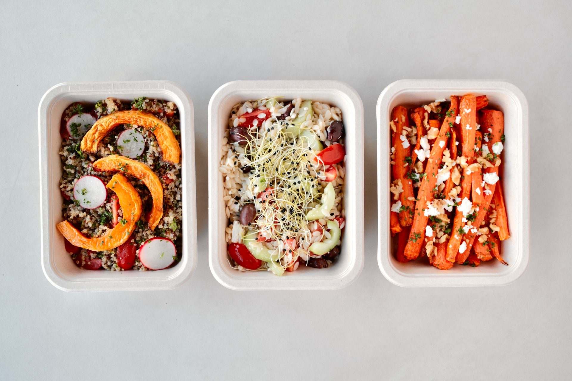
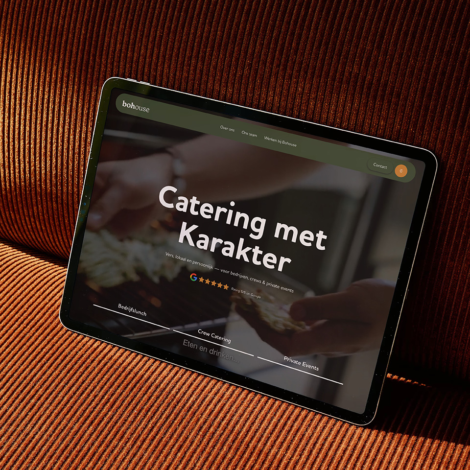
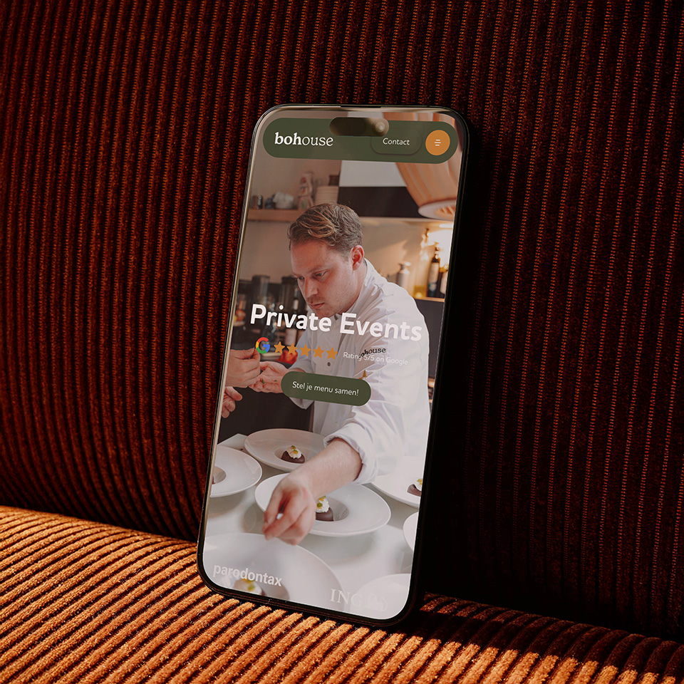
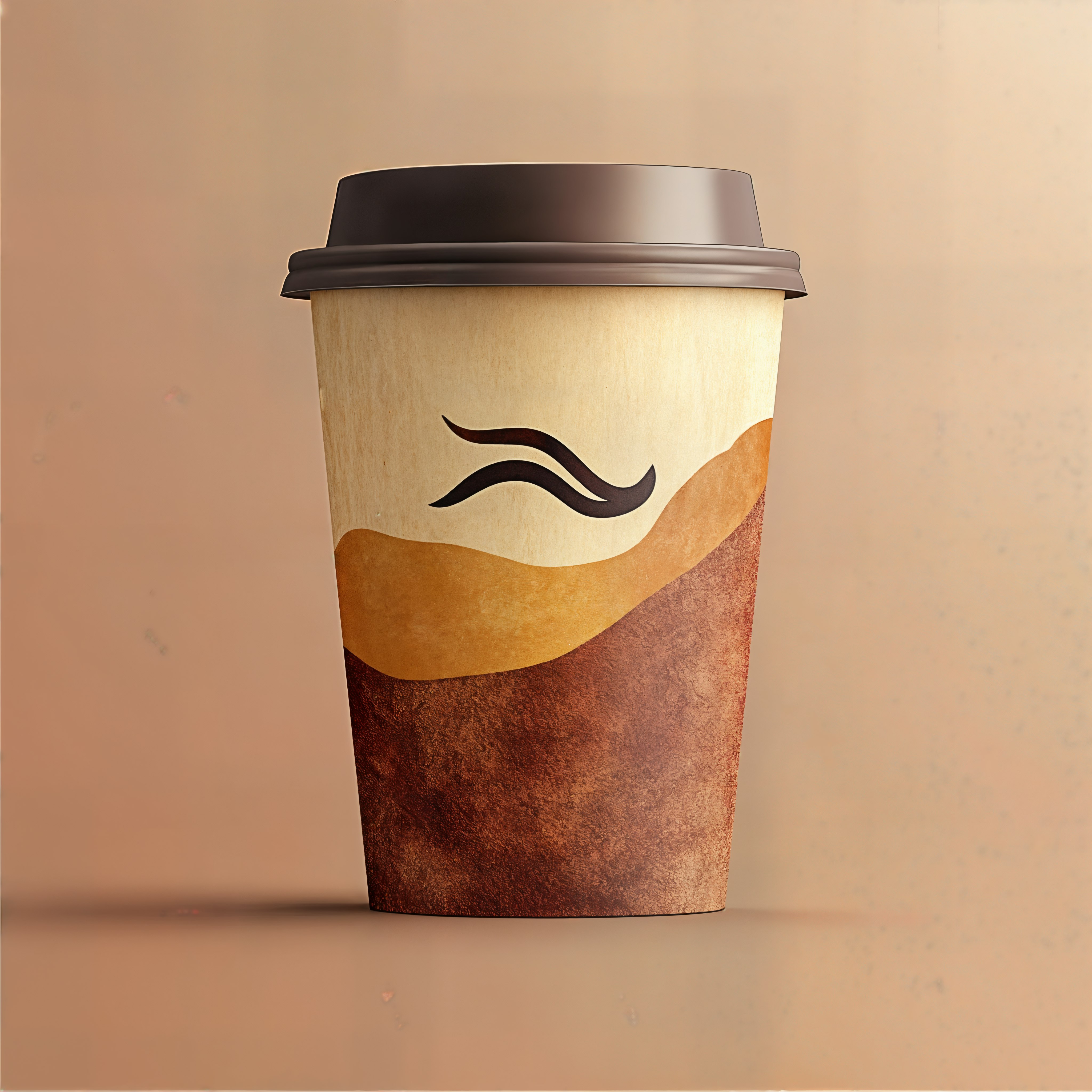
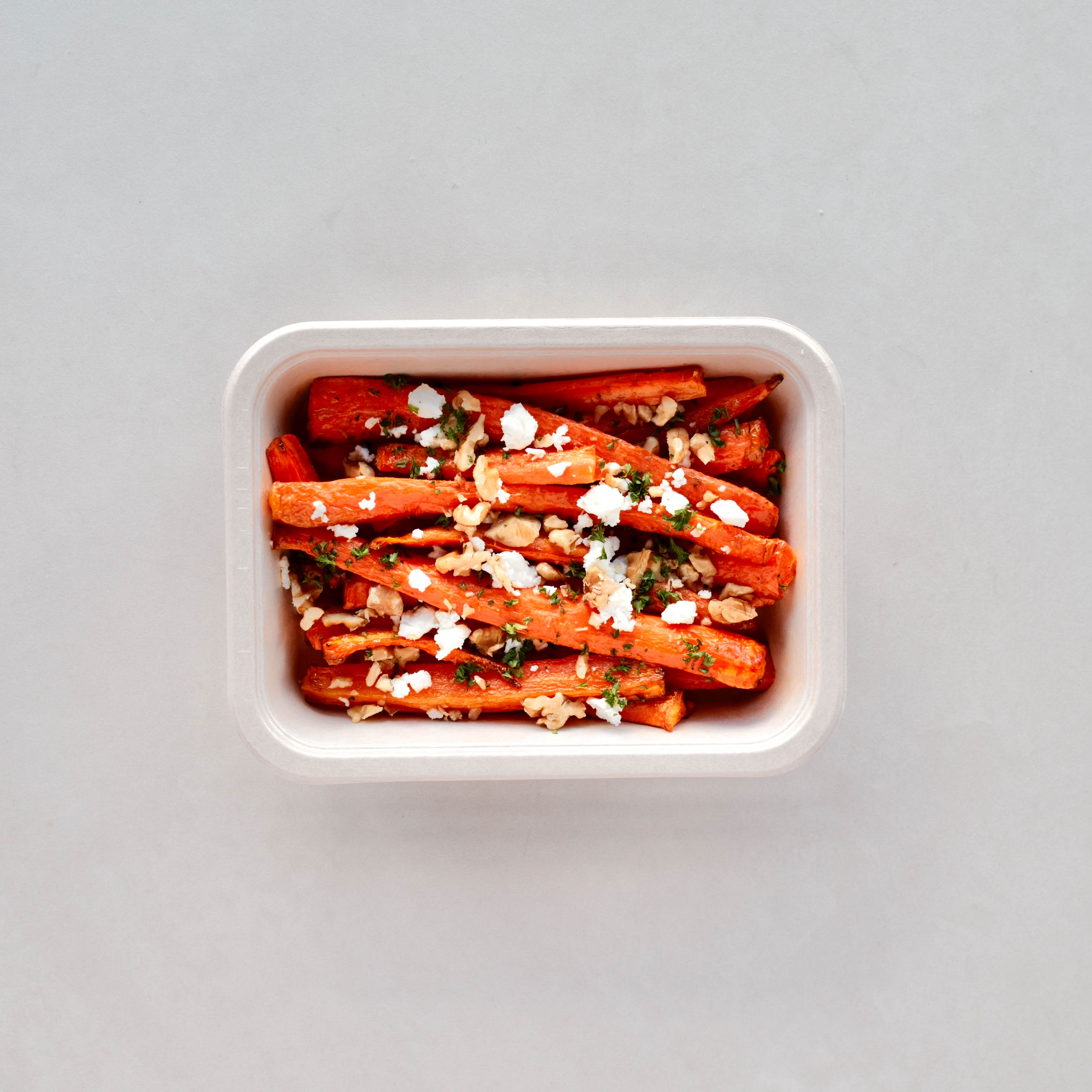
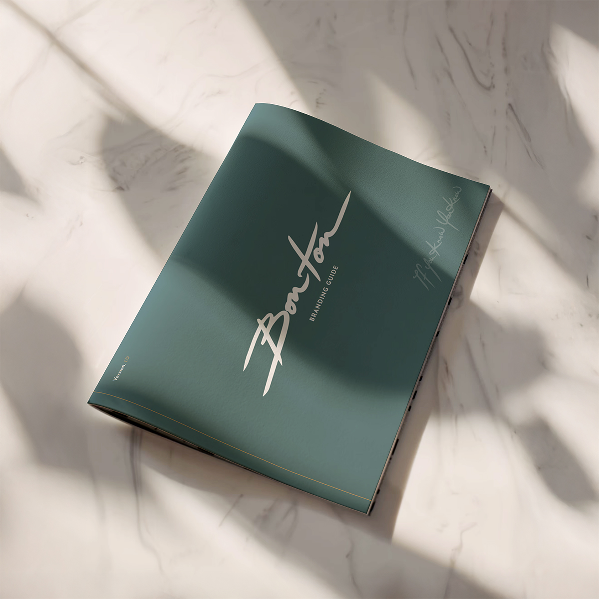
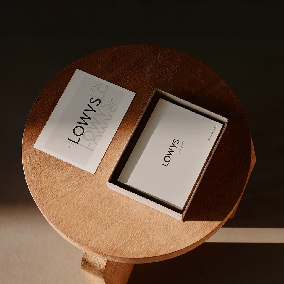
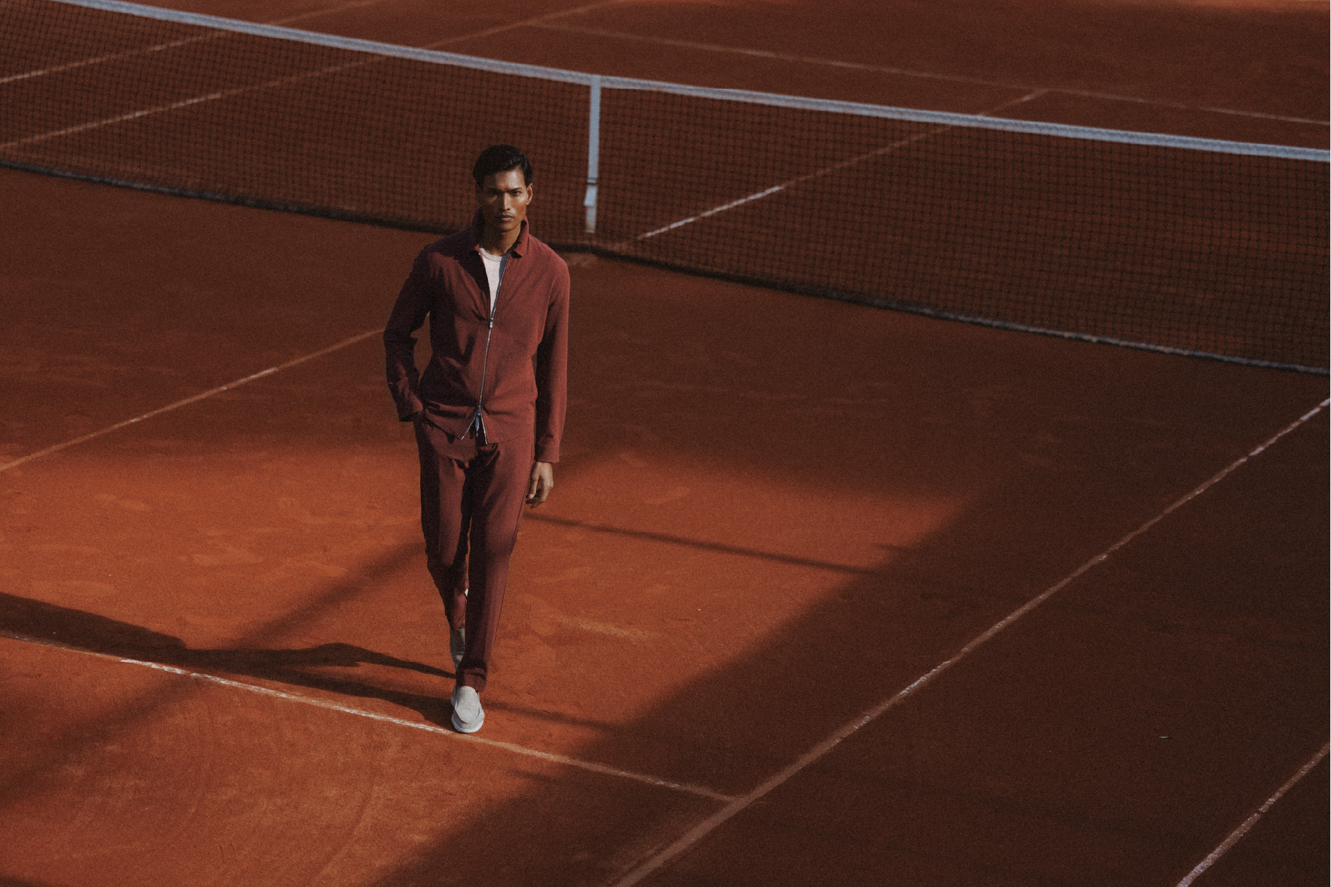
From launch to growth, we partnered with Bohouse to build their brand system and evolve their digital presence, ensuring consistency, adaptability, and a clear sense of identity at every stage.

We will do the best to get back to you as soon as possible within 24 hours!


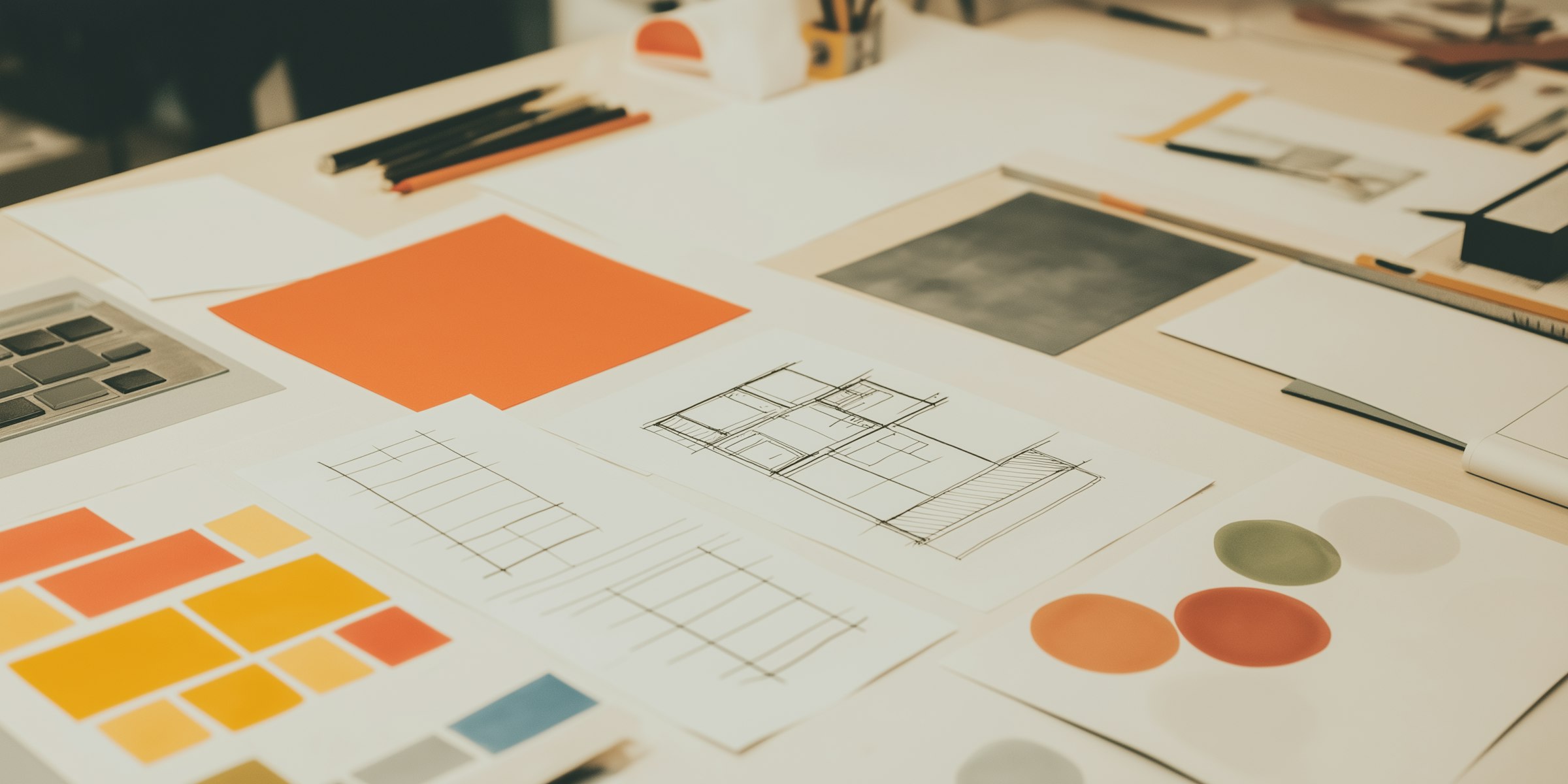
A creative agency specialising in strategy, branding, and growth to bring ideas to life.