BonTon

Formalising the identity of an established nightclub in Amsterdam

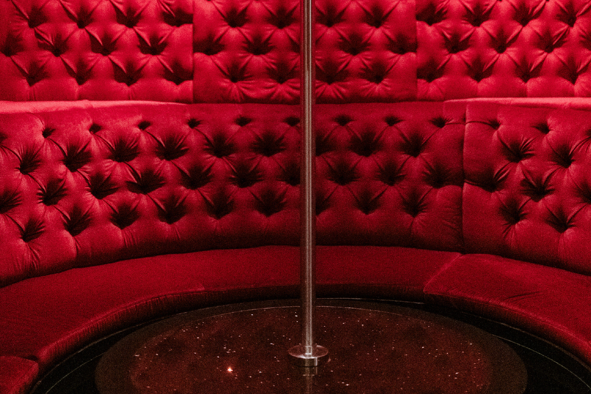
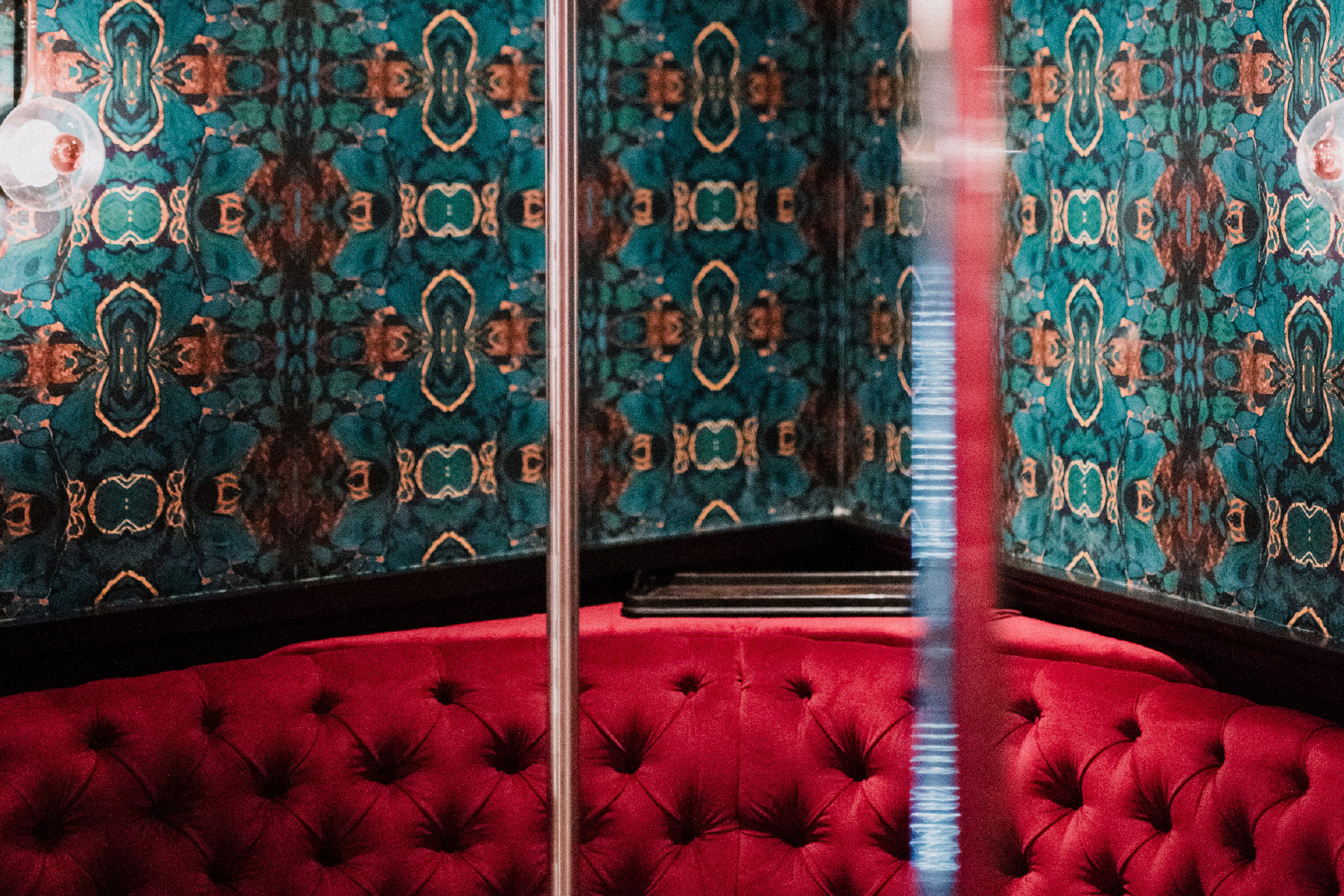
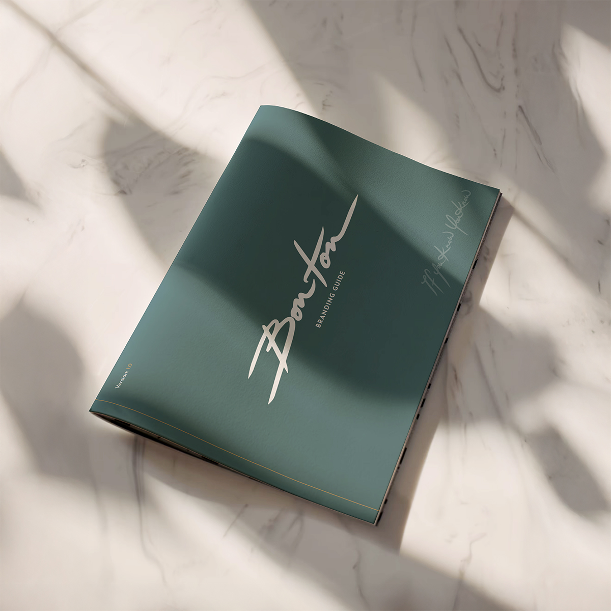
Bonton had a visual identity and strong presence. We did not develop the design system — we documented and structured it. Our role was to bring consistency to its use, supporting alignment across formats and future expansion.

Client
BonTon
Services
Framework
Identity
Workshop
What we did
Guidelines
Graphic Design
Tone of Voice
Messaging Strategy

BonTon, a well-known club in Amsterdam, already had an established look and feel. But like many fast-moving venues, the identity lacked an internal framework. As the brand expanded across touchpoints, inconsistencies emerged — creating friction in both production and perception. The absence of clear rules made design decisions harder to scale.

Our role was not to redesign, but to stabilise. We preserved the existing logo and core palette, and built a system around them. This included typographic logic, spacing standards, usage thresholds, and brand architecture principles that clarified how sub-brands and spaces relate to the whole. The work translated instinct into direction — giving teams what they already understood, in usable form.

BonTon
BonTon
The challenges

The brand already had presence — the task was to make it durable. Without formal guidance, identity drift had started to set in. The challenge was to protect what worked while giving the team tools to apply it at scale. We built a system that respects the original tone and gives it structure — sharp, repeatable, and ready to grow.

The Solutions

The guidelines were designed to be direct and usable. Every element balances edge with control — reinforcing Bonton’s character while reducing ambiguity. The system now supports consistent application across digital media, print, merchandise, and in-venue design — without flattening expression.